

Herb Lubalin
2026
Herb Lubalin
A complex, homage-driven typographic poster celebrating the legendary graphic designer Herb Lubalin. The design is an intricate puzzle of interlocking, massive letterforms, negative space, and integrated quotes, reflecting Lubalin's own avant-garde approach to layout.
TYPE
Typographic Poster
ROLE
Art Director & Graphic Designer
CATEGORY
Typography
SOFTWARE
Illustrator
THE BRIEF & VISION
The goal was to create a poster that embodies the spirit of Herb Lubalin's work, treating typography not just as a vehicle for reading, but as image and structure. The vision was to build an aggressive, architectural display of type that demands the viewer's active exploration.
VISUAL LANGUAGE & TYPOGRAPHY
The canvas is dominated by large, intersecting letters that form words like "MORPH" and "AVANT GARDE" in various shades of navy blue, cyan, and stark white. The letters feature heavy 3D drop shadows that create a deep sense of space against a dark background.
ARTISTIC COMPOSITION & DETAILS
True to Lubalin's style, design quotes run along the edges and paths of the giant letters, such as "Alignment solves 90% of emotional problems" and "Good ideas need coffee". This turns the structural lines of the letters into functional pathways for micro-content.
LAYOUT & INTEGRATION
The layout is a dense, interlocking grid where negative space is utilized as functional framing. A concise biography of Lubalin is elegantly fit into the negative space of a massive 'M' at the bottom, balancing the display type with readable body copy.
Gallery
IMAGE

Herb Lubalin
A highly complex, interwoven typographic puzzle dominates this poster, paying tribute to Herb Lubalin. Massive, interlocking letters in shades of cyan, teal, and white overlap with heavy drop shadows to form words like "MORE", "DESIGN", and "AVANT GARDE". Design quotes are cleverly fitted along the winding strokes of the giant letters. At the bottom, a colossal "M" creates a negative space window housing a small, readable biographical text, balancing the aggressive display typography with structural elegance.
HONORING A LEGEND
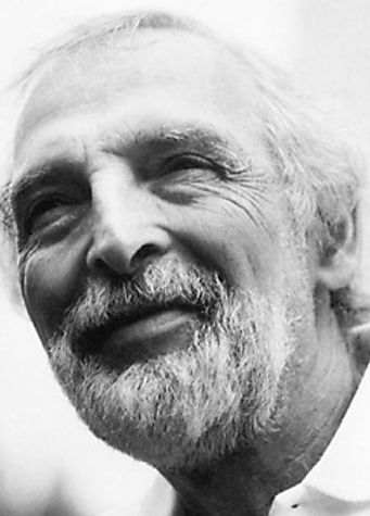
1918 - 1981
Herb Lubalin is not merely a graphic designer; he is a legendary visionary who breathed life into letters and rewrote the rules of typography. He shattered the rigid, "strictly for reading" conventions of his time, proving to the world that letters can be more than just text—they can be a powerful visual, a raw emotion, and a standalone illustration. His revolutionary approach, which he called "typographics," involved tightly kerning letters until they touched, interlocking forms, and creating expressive ligatures that transformed words into communicative art.
For Lubalin, words couldn't remain silent; they had to shout, whisper, cry, or make you smile. When looking at his iconic "Mother & Child" or "Families" logos, one instantly feels the clever, emotionally resonant visual stories hidden within the anatomy of the words. As a co-founder of ITC (International Typeface Corporation) and the driving force behind the legendary U&lc magazine, his contributions irrevocably changed global design culture.
This poster is not just a structural design experiment; it is a heartfelt tribute to a master who taught us how to play with the architecture of the alphabet. It is a nod to the man who liberated typography from the constraints of the printing press and elevated it to a fine art. His courage still echoes in our work today, reminding us that rules exist to be masterfully broken. With endless respect to his enduring legacy...